For more archives, go to the Advance Archive/Search Page.
Borrow Color Schemes From Art,
Nature, Says Gardening Expert
Look at the way artists use color, and pay attention to the colors around you, Sydney Eddison told the audience at a conference for garden enthusiasts.
|
|
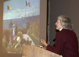
Sydney Eddison, author and contributor to Fine Gardening, discusses the use of color in art as a source of ideas for
working with color in the garden, during a day-long conference at Rome Commons Ballroom March 9.
Photo by Peter Morenus
|
Author of The Gardener's Palette: Creating Color in the Garden, Eddison explored the connections between color in art, in nature, and in the garden during her talk, "The Rainbow Contained," on March 9 in the Rome Commons Ballroom.
More than 400 people attended the conference, which was sponsored by the plant science department's ornamental plant extension team.
"Gardening is the number one leisure activity in the U.S.," said Richard McAvoy, professor and extension specialist in plant science. "People are really hungry for quality information on the topic."
Eddison, who has been a painter and scene designer, said a bit of color theory will help those gardeners who are "not automatically brave and daring.
"I can tell you all you need to know about color in approximately six minutes," she said.
Showing a slide of the color wheel, she said, "Contrast and harmony are the two classic ways of using color. Contrasting colors are opposites on the wheel. Pairing flowers and plants in contrasting colors - red and green, orange and blue, or purple and yellow - will give you a jolt."
Colors that appear next to each other on the color wheel and share a common pigment are harmonious, she said. When grouped together, these colors give a "wonderful, calming, soothing effect." A cool color harmony might include flowers in mauve, violet, and blue.
Eddison advised the audience to borrow color schemes from painters and fabric designers, and to take pictures and samples to garden centers.
Artists get their color ideas from nature, she said, and so should gardeners: "Nature tends to use her brightest, strongest, most saturated colors in small doses. That's a good tip for the garden."
With Claude Monet's painting Terrace at Ste. Adresse projected on a large screen, Eddison pointed out the contrasting colors of red geraniums and gladioli against green foliage and lawn, and the harmonizing tones of red, orange, and yellow nasturtiums. "Every lesson you need to know to garden with color is in this painting," she said.
Eddison recommended trying different color pots, fabrics, and outdoor furniture to enhance the colors in a garden.
After "falling in love" with a painting by French artist Paul Gaugin, she decided to try matching the colors with pots and plants. She found flowers and foliage in the right colors including red geranium; orange-salmon Salvia splendens 'Carabiniere Orange'; Phormium tenex with salmon and olive-green striped foliage; a coleus with the same colors; and Helichrysum 'Limelight'. But when she couldn't find a suitable blue-green container, she eventually had one made to order.
Try pairing plants and flowers with different tints, tones, and shades of contrasting colors, she said. "Take dark tones and shades of red, for example, and combine them with light, sharp, acid-yellow green. You'll get contrast, but it will be softer."
If you have two disparate colors in your garden, she said, put "little steps in between. Look at the color wheel." For example, if the flowers are yellow and red, add a yellow that warms up a bit as it approaches gold. "If you want colors to go together and want that wonderful sigh of pleasure and rightness, put together a string of colors that are very near each other."
Gardeners should also take inspiration from nature, Eddison said. As an autumn scene of bright orange sugar maples against a blue sky flashed on the screen, she said, "This is an absolutely full-bodied 'wow' color scheme. If it works on that grand scale of nature, it is most certainly going to work in a garden bed."
Exploring the complementary yellow-blue contrast, she showed a field with golden rod and purple ironweed. "It just plain works," she said.
And for "the brightest, most crisp, and coolest combination," she said, try white and green.
Eddison is the author of five books on gardening and a frequent contributor to Fine Gardening and other publications.

