This is an archived article.
For the latest news, go to the
Advance Homepage For more archives, go to the Advance Archive/Search Page. 
| |||||||||||
And of course you are correct. No need to quibble that the Alma Mater, also known as Old Connecticut refers to "Our fairest White and Blue." Nor that in the Fight Song, officially known as UConn Husky, we sing for "vict'ry again for the White and Blue." Whether Blue and White or White and Blue, we are certain of the colors. But that hasn't always been true. Whether blue and white or white and blue, we are certain of the colors. But we haven't always been so sure just what shade of blue is really UConn Blue.
True Blue The reason for the request is not in the brief letter, but the letter was passed along to Walter Stemmons, who headed the University's publications department. Stemmons launched an "investigation," that he outlined in an article in the February/March 1947 issue of the Connecticut Alumnus. He had received a variety of answers from faculty and alumni. Andre Schenker, a professor of history who had done considerable research for Stemmons' book on the first 50 years of the University's history, offered a guess that the colors were adopted from the State Flag. Stemmons rejected that idea, however, based on the description of the flag in the State Register and Manual, which included a number of different colors.
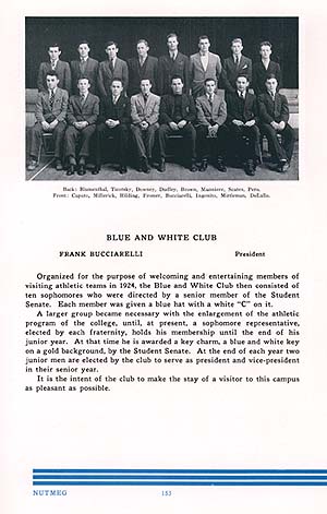
Several administrators and faculty suggested that the colors had "always" been Royal Blue and white, although Leonard Riccio, the university comptroller, responded that the colors were blue and white, but not Royal Blue and white. His source: the color of the corridor walls in Hawley Armory. Stemmons also quoted several alumni who recalled that blue and white were selected as the colors in the 1890s, when UConn was Storrs Agricultural College. Grace Snow Palmer Minor, one of the college's first women graduates in 1896, wrote that the colors "were chosen when the name Storrs Agricultural School was changed to Connecticut Agricultural College," which would put the color selection in 1899. More than 50 years after the fact, Stemmons reckoned, Ms. Minor was referring to the renaming of the school as Storrs Agricultural College - which occurred in 1893. And that is corroborated by the recollections of other alumni who corresponded with Stemmons: Ethel Freeman, a classmate of Grace Minor, recalled that "In 1893-4-5 (sic) the college wished to adopt blue as its own color. At that time - queer as it seems now - Storrs and Yale were rivals for the state appropriations and some feelings [See Box Below] - not serious - existed between the two schools. "In as much as blue was Yale's color, this college did not feel that it had the right to use it alone so added the white," Freeman wrote. John Fitts, Class of 1897, the college's first instructor in engineering and first dean of the Division of Mechanical Engineering, recalled that the colors "were chosen by the Students' Organization in the year 1896 or 1897. "Why the colors were chosen I do not know, but I believe that 'Blue Skies' and 'White Clouds' were mentioned at the meeting," he said. Harry W. Potter of Glastonbury, Class of 1896, remembered in a tersely written letter that it was a joint committee of students and faculty who selected the colors: "Recall that a Faculty-Student Committee was formed for the purpose of selecting colors for the college either in 1893 or 1894, cannot recall date." Based on those recollections, blue and white have been the colors of the University since the mid-1890s, possibly as early as 1893. But that was not to be the end of the matter. Ten months after the Stemmons article appeared, the UConn Alumnus offered an addendum - first noting that on Alumni Day in June 1947, two members of the Class of 1887 "displayed a pair of class badges that were unmistakeably (sic) a very light blue." And it cited a book published in 1930, The Dictionary of Color, which listed Connecticut Agricultural College's colors as "imperial blue and white. "Incidentally, imperial blue is a light blue, but darker than Rhode Island's robin's egg blue."
Selecting a Shade In a letter dated Oct. 6, 1952, President Albert N. Jorgensen appointed a five-member special committee to "study the need for official school colors." A review of the University's records found that the colors were never officially accepted - and "by official, we mean that it has not been acted upon by our Board of Trustees," wrote committee chair J. O. Christian, then the University's athletics director. It didn't take long for the committee to investigate the matter. Their letter of response with recommendations is dated October 21, just over two weeks after they were appointed. Although their tenure was short, the committee did examine the matter thoroughly. In a letter to President Jorgensen, written by Christian on behalf of the committee, it is noted that the group examined "55 shades of blue and found there were many more." They examined the colors at the American Thread Co. in Willimantic, under the supervision of ATCO's head chemist, Howard Corkrum. The sweater presented to UConn athletes at the annual awards program was taken to Corkrum, who matched the navy blue garment with a standardized color known as "Homage Blue", listed as #70078 in the Standard Color Card of America, at that time the standard reference for colors.
But the committee recommended the University adopt a slightly different shade, #70077, known as National Flag Blue, as the blue in the Blue and White. "There is little difference between the two shades and we felt that the National Flag Blue would be better known than Homage Blue," wrote Christian. He added that National Flag Blue is "just a shade lighter than Homage Blue and according to Howard Corkrum the Homage Blue is a little deeper and has a little greener hue. Midnight Blue, the next shade, is a little more red than the National Flag Blue." So, National Flag Blue it was that the Board of Trustees approved at their November 1952 meeting, when they finally adopted blue and white as the colors of the University of Connecticut. One paragraph in the Christian letter, however, set the stage for a return of the "blues" over the next several decades. "All three of these colors [National Flag, Homage, and Midnight] could be used with the different uniforms and no one could tell the difference unless you saw them side by side. It may be that in picking a uniform for the band that the Midnight Blue or the Homage Blue may be more practical than the National Flag Blue. I doubt that anyone could tell the difference." Neither the committee's recommendation nor the trustees' motion included a standard for the colors, and by the late 1950s, the shades of blue used in printing, uniforms, and University souvenirs began to vary widely again.
Setting Standards Tolokan's research re-discovered the trustee action of 1952 in which National Flag Blue was selected. Under modern color standards, that translated to a shade known as PANTONE© 289. A standard was set for the color - as well as for athletic logos and their use. No standards were set for non-athletic logos, however. That task was taken up in 1996-1997 by University Communications, which commissioned Peter Good and Janet Cummings, alumni of the School of Fine Arts who have their own graphic design company, to create a new visual identity for the University. It had been found that using PANTONE© 289 was problematic, particularly in print publications - National Flag Blue is so dark as to be barely indistinguishable from black in some printing. For the new standards, a slightly lighter shade of blue - PANTONE© 281 - was adopted as the new shade of blue in the visual identity program. And to avoid the problems of the past in which variations became the norm, a Graphic Standards and Guidelines Manual (on the web at http://www.uconn.edu/info/logos.phpwas developed to assist anyone who might again wonder, "what is UConn Blue?" Of course, there is still the question of the White. Could be Eggshell. How about Ivory? Maybe Off-White? Or is it just plain Vanilla? Mark J. Roy Sources: UConn Alumnus, Vol. XXV, No. 2, "How Did The University of Connecticut Get Its Colors?" by Walter Stemmons; News Release #117A, Nov. 25, 1952, News Coordinator's Office; and various correspondence found in the archived files of the Office of Public Information. These items and others relating to UConn history are in the University Archives of the Thomas J. Dodd Research Center. 
|
 hat are the colors
of the University of Connecticut? As you
read those words, you probably didn't hesitate. Blue and white
are the colors of Connecticut.
hat are the colors
of the University of Connecticut? As you
read those words, you probably didn't hesitate. Blue and white
are the colors of Connecticut.